Chill Pill App: Full Case Study
An app for stressed and anxious students to unwind and take care of their mental well-being.

Background
General Assembly User Experience Design Course 2020
Course Instructor: Kiri Martin
Duration: 10 weeks
Role: Solo UX/UI Designer under the guidance of expert UX Design consultants
Problem: Busy students need a way to relieve stress and anxiety because school responsibilities combined with the current global crises can become overwhelming, causing them to live in an unhealthy state, both mentally and physically.
Overview and Purpose: When COVID-19 struck and schools closed down, a lot of pressure and extra stress was put on students. Many internships were cancelled, school events were put on hold, and the online learning environment proved to make learning a much more difficult task. And even beyond that, lives were (and honestly still are) being flipped on the head. The polarization of the nation over the killing of George Floyd, the Western wildfires causing people to evacuate homes, and the saddening death of notorious R.B.G. (rest in power <3) are just a few major moments from this year that continue to impact many lives for the worse. It just seems like one thing just keeps on coming after another. Being a college student myself, I’ve noticed how I am not alone in struggling with keeping up with school expectations while juggling insecurities about our future, world events, and life in general. It’s been tough.
As a result, the purpose of my mobile app is to provide organized and engaging content for stressed out students that will increase their quality of life by promoting healthier mental and physical well-beings.
User Research
User Interviews: Key Findings and Trends
“I need something that is engaging and interesting.”
“I want to destress and relax from my school and part-time job responsibilities.”
“I have to gain back more control and stability in my life.”
“I can’t make big time commitments on top of school.”

To further explore this problem, I conducted user interviews to really make sure this was a problem faced by students. After conducting 8 user interviews, I did find that students around ages 16 - 23 generally reported greater stress and anxiety levels compared to other age groups. Using the common trends I found regarding user needs and pain points, I created a user persona (shown above!) that summarized the goals and frustrations of my target group, helping me to really hone in on who my users are as I continued through the design process.
The challenge I now identified was: How might we devise helpful and accessible ways for students to relieve themselves from the stress and anxiety that comes from everyday life, given the current state of global turmoil?
Information Architecture
My next step was delving in to competitive research! I conducted a competitive analysis of 3 different competitors (Headspace, Calm, and Spotify), which helped me decide what features I wanted to include in my own app, while also showing me what I might want to avoid…
For example, a consistent problem that I found throughout my competitor apps was that they contained too many features or pictures that could easily overwhelm users, potentially causing them to not use the app. This was something that I made sure to stay clear from since my users were already notably overwhelmed and stressed by life itself (no need to pile on!).
With the competitive research in mind, I conducted a feature prioritization in order to sift and sort through all my ideas (there were a lot haha). I really wanted to prioritize the features that would best serve the user’s needs and goals, even if this meant sacrificing some cool or fun features I wanted to add, but wouldn’t necessarily add meaningful value to the app.
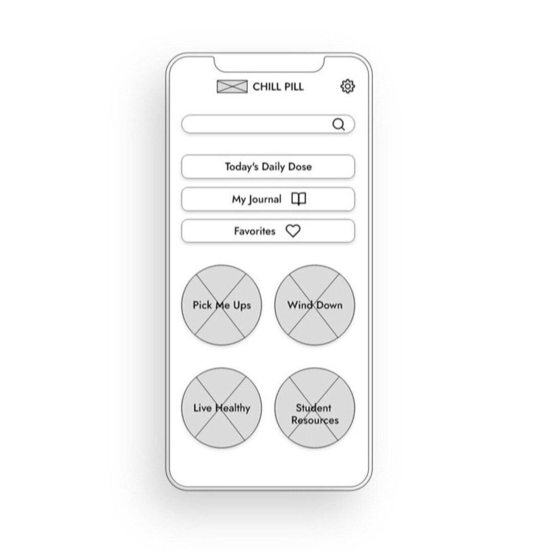
After narrowing down the features of my app (making sure to include features that are expected by users and high impact according to my 2x2 matrix), I performed 4 card sorts with potential users to test whether the way I organized the content of my app aligned with my users’ expectations.


During the card sorts, users found one of my category titles “Take Care of Your Body” misleading and unclear for the content that could be found within it. To address this, I decided to change the category title to “Live Healthy”, since this encompassed tips, articles, and exercises that all promoted healthier living, rather than just specifically a healthy body. With the findings from my card sorts in mind, I reflected any changes to the IA of the app in my site map and user flow. Here is the final site map (shown above!) and the final user flow (shown below!) that prioritize an intuitive organization for first time users.
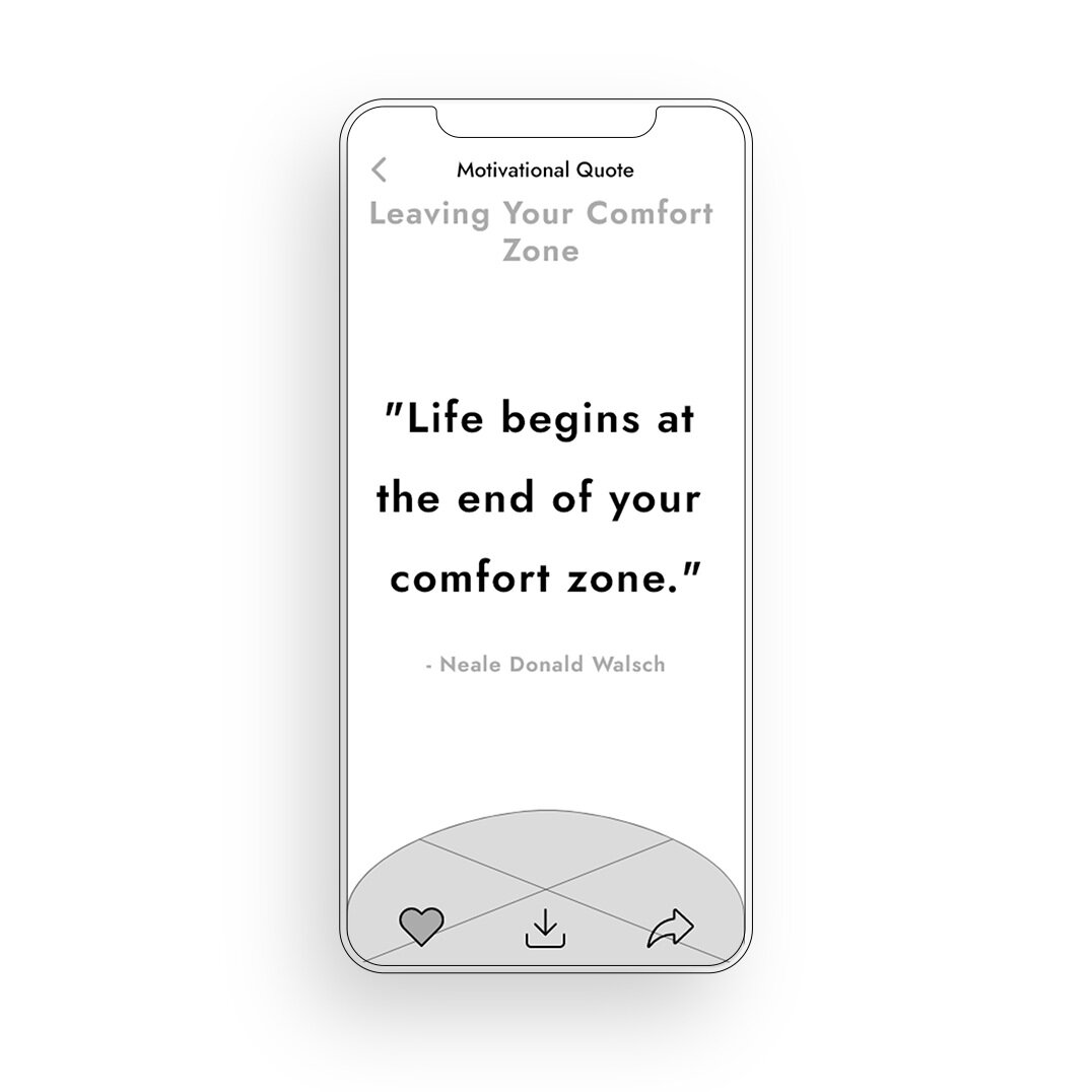
User Flow: Favoriting a Motivational Quote

With all this in mind, it was time to start on the screen design! With a clear user flow outlined, I began to create paper sketches of screens to visualize this flow even more. For each iteration, I conducted a round of usability tests to ensure that my designs were still aligning with user needs and targeting their pain points.
Screen Design

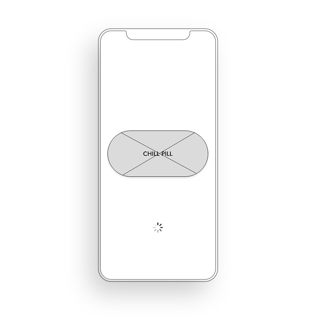
Splash Screen

Home: Users were surprised that there was no search bar to find things faster. Take Care of Your Body category name was off putting.

Pick Me Ups: Users found the scrolling frustrating and were confused about the filter. There was also confusion about what was read vs. not.

Tip: Users clearly understood how to favorite the tip, but were surprised to find no share feature.
Paper Prototype 2.0
Favorite an Unread Motivational Quote
Here is the second iteration of the paper prototype. Users enjoyed changes made that improved readability, usability, and convenience.

Wireframes
After sketching screens and performing a handful of usability tests, I transformed my sketched ideas into mid-fidelity wireframes.
During usability tests, users really enjoyed further improvements made to the consistency, clarity, and organization of the app!


Hi-fidelity Wireframes and Interactive Prototype
And… here are my high fidelity wireframes! After a final round of usability testing, I revised the buttons on the top of the home page to match the bubbly UI theme. I also added an onboarding to help first time users navigate the app and understand the purpose of Chill Pill a bit better. With the target user group in mind, I went with a playful color palette that is fun, but not overwhelming.


Feature - Daily Dose

Daily Dose provides new words of encouragement every single day! I wanted to include a feature that provides content that changes daily in order to keep users engaged in the app and looking forward to something new. Users can even receive phone notifications (can be toggled in settings) of the Daily Dose, which will draw in users to click in to the app and explore more of its features.
Feature - Student Resources
Given that I am targeting a student population, I wanted to include a unique feature that provides resources and specialized help for students and their problems. Here, students can find tips and articles about how to survive school, as well as hotlines and counseling resources if they need extra help or guidance.

Feature - My Journal

During the interviewing stage, many users wanted a place where they can release and express their current feelings and emotions. Although the majority of the app consists of de-stressing content created for the students, the My Journal feature allows users to create their own entries for whatever is on their mind. Just some of the things that users can do with this feature include reflecting on their day, writing down what they are grateful for, and jotting down self-meditation notes.
The Takeaways
As a newbie to the UX design world, completing an entire case study beginning to end was such an interesting and wonderful learning experience! However, no project is ever completely “finished”. There were definitely things I could do in the future to improve upon this project and make it even better suited for users.
Some next steps for the future:
Continue to refine features to better address user needs and goals (aka, how do I keep the stress away and the good vibes rolling in? :D)
Perform more usability tests to gain greater feedback
Add games as a unique, additional relaxation feature (this was an idea I had early on in the brainstorming stage, but I decided against it because it wasn’t feasible for the amount of time and resources I had at the moment. But maybe in the future!)
Some helpful tips and reminders:
Less is more! Once you have an app idea in mind, it’s really easy to want to include so many different features for your users. But something that I’ve learned from this experience is that usually it’s better to refine a FEW features that best serve your users and then go from there.
Keep going back to your users! As a UX designer, it is your job to make the user the center of the product. Are you addressing their core needs and pain points? Are you helping the user achieve their main goals? Always remember to keep your persona in mind as you make design decisions.
Be a good self-critic. While it is never useful to be overly critical of yourself of your work, it’s still important to evaluate your own designs and judge how they can be improved. I learned that its best to not get super attached to any designs that you have made, because often times those designs may need to change based on any learnings gained from testing the actual designs with the user. Know when to admit fault, and then keep growing from there. <3 You got this.