Rooted App
An app for novice plant owners to educate themselves about plants and how to care for them so they thrive.
Background
UC Irvine Informatics 132 Project Winter 2022
Duration: 10 weeks
Role: UX/UI Designer
The Design Team: Carly Chan, Karla Avalos, Regina Tambunan, Kevin Tsai, Rohan Hemrajani
Purpose: Plant parenting is tough. The average plant parent has killed seven plants they’ve brought into their home. My team of 6 designed a mobile application to better educate plant owners about their plants and how to properly take care of them so they can thrive!
Problem Statement
We started with some desk research to find what current plant owners are saying about their struggles & needs…
67% of those who have plants said “plant parenthood” is tougher than they expected it to be, and 47% of those surveyed say they don’t currently own plants because they don’t know how to care for them.
How might we educate plant owners about their plants and how to care for them in and around their home?
60% say their top anxiety about being a plant parent is making sure they have enough sunlight, and 56% say it’s ensuring they have enough water.
How might we help plant owners efficiently plan, care for, and keep track of their plant activities/needs?
Evidence: Article/OnePoll Survey — Deseret Article / NY Post Article / Survey Source
Competitive Analysis
Our team analyzed 6 direct and indirect competitors involved in care, education, and habit tracking.
We looked at gardening apps such as PictureThis and Gardenia that assist in the care of both indoor and outdoor plants, other types of species identification apps such as Dog Scanner and Shroomify, and some popular YouTube channels that offer experience-based advice for gardening and plant care.
Analyzing their strengths & weaknesses, we gained knowledge about existing patterns that we wanted to improve upon (or discard) to innovate a solution that stands out from current apps in the market.

User Interviews & Key Insights
We conducted 12 user interviews that helped us gain further insights on the needs and attitudes of plant owners across a range of experience levels. I helped formulate the interview protocol and guide to ensure all team members were aligned on how to conduct interviews properly to collect meaningful data.
After interviews, we gathered all notes from each participant into one Miro board. Organizing participants of varying plant experience by color, we were able to identify trends and needs across different user types within the greater “plant owner” user group.

Key Insight #1: Individuals use a variety of mediums to learn and understand how to better care for their plants.
90% of all interviewees refer to online resources for finding plant info.
Key Insight #2: Novice plant owners fixate their care attention on water and sunlight.
4 out of 5 novice plant owner interviewees described processes of plant care as “water and sunlight”.
Key Insight #3: Plant owners don’t want to keep a strict schedule for plant care, but still want to be consistent.
8 out of 12 interviewees didn’t have or want to implement a strict schedule for plant care.
Sketches & User Flow
Taking into account our desk research and newly acquired learnings from user interviews, we decided to narrow scope to target new plant owners who want basic help in gaining plant-related knowledge and supporting their care routines.
Our approach: Build an intuitive, captivating experience that educates plant owners about their plants and how to care for them, without being overly complicated.
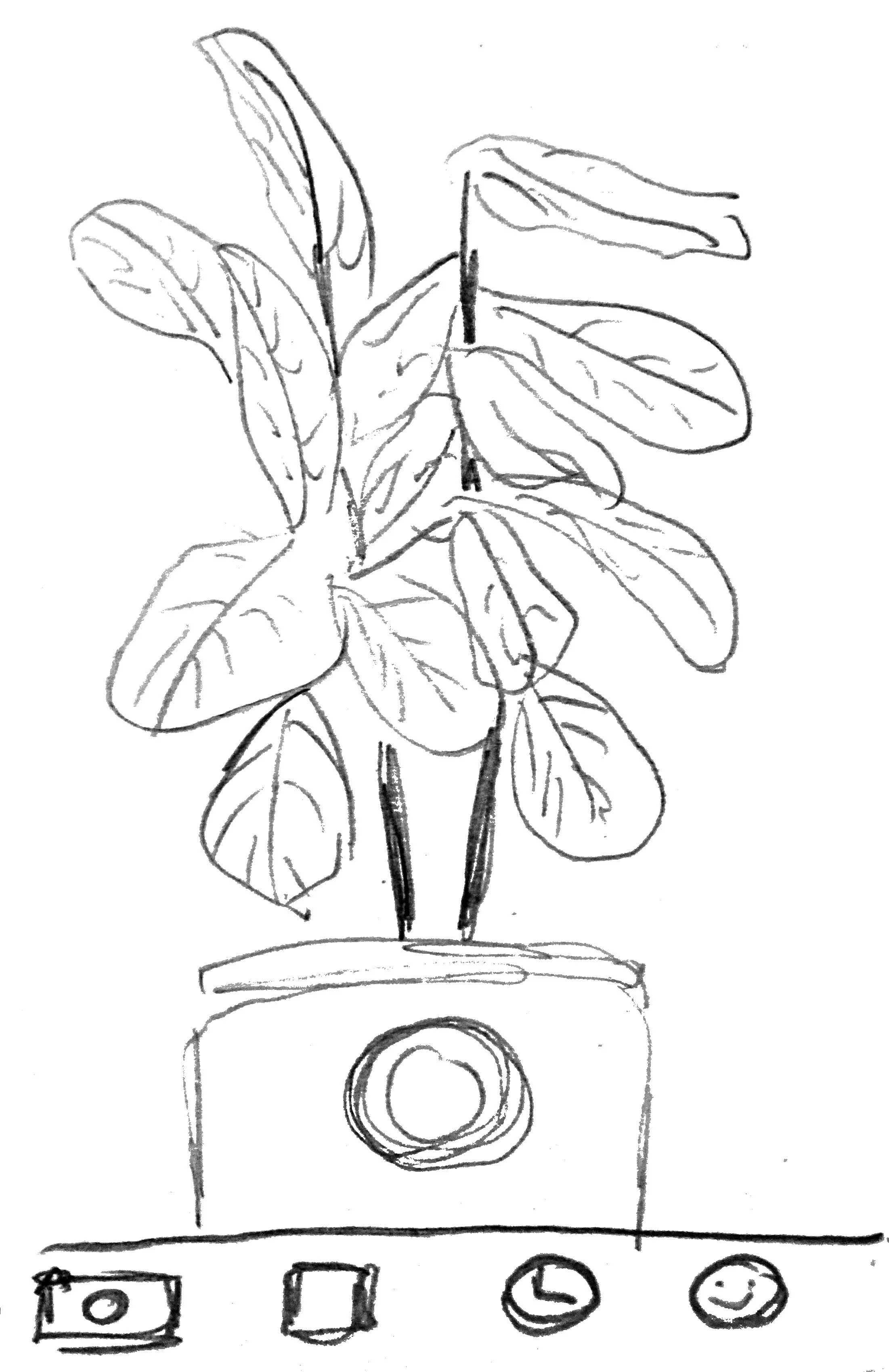
Plant scanner: camera where user can identify a plant.
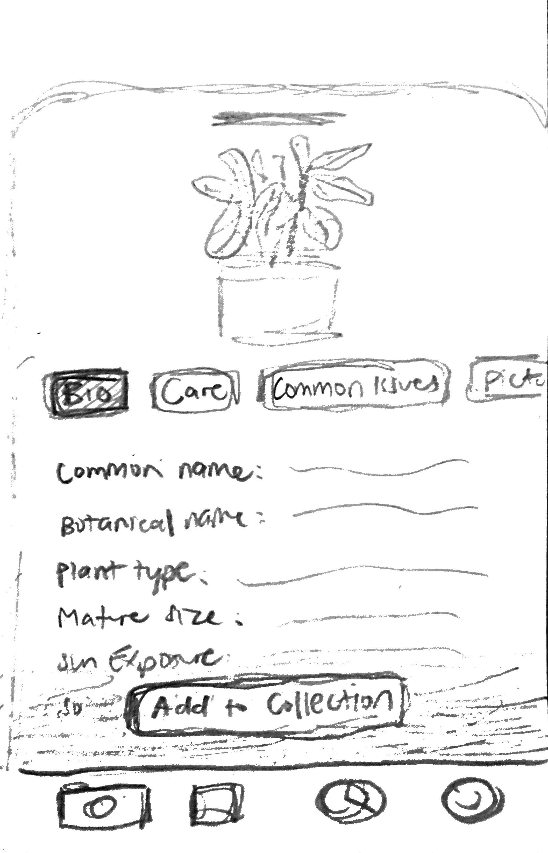
Plant scanner: plant identified and bio card opens. user has option to add the plant to one of their collections.
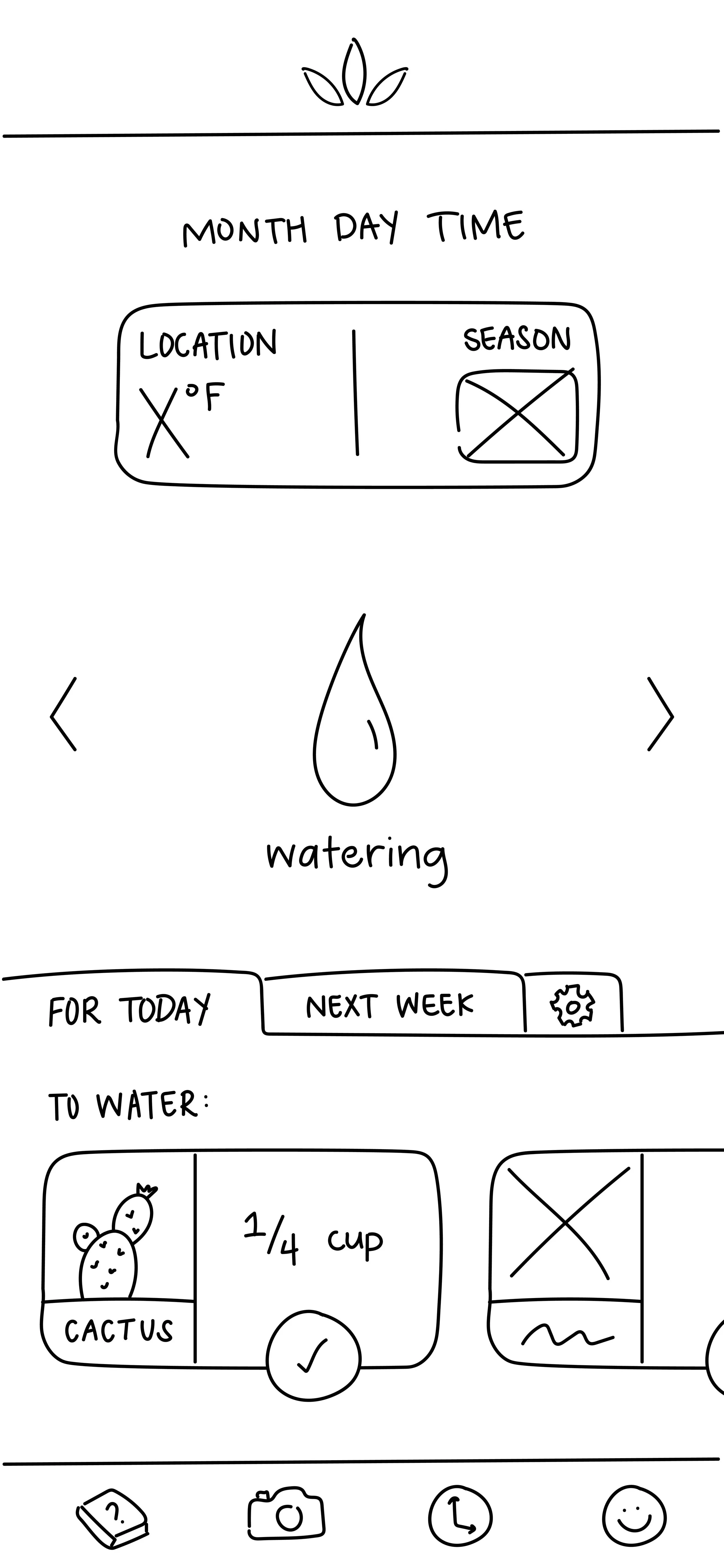
Reminders: reminder to water cactus, marked as complete by user.
Reminders: a user can set up reminders for basic plant care schedules.
Plant encyclopedia: initial design utilized categories to filter users into the plants they wanted to find.

Plant encyclopedia: initial idea for showing key facts about a plant required for care.

Above we have our core user flow from our sketches, which starts at the onboarding process and allow users to access our other features using the navigation bar at the bottom of the screen.
Mid-fidelity Prototype & Updates

After evaluating and critiquing our sketches within our group, we made changes and updated designs to mid-fi wireframes.
Our full feature list includes: onboarding, plant encyclopedia, reminders, plant scanner, explore, and user profile.
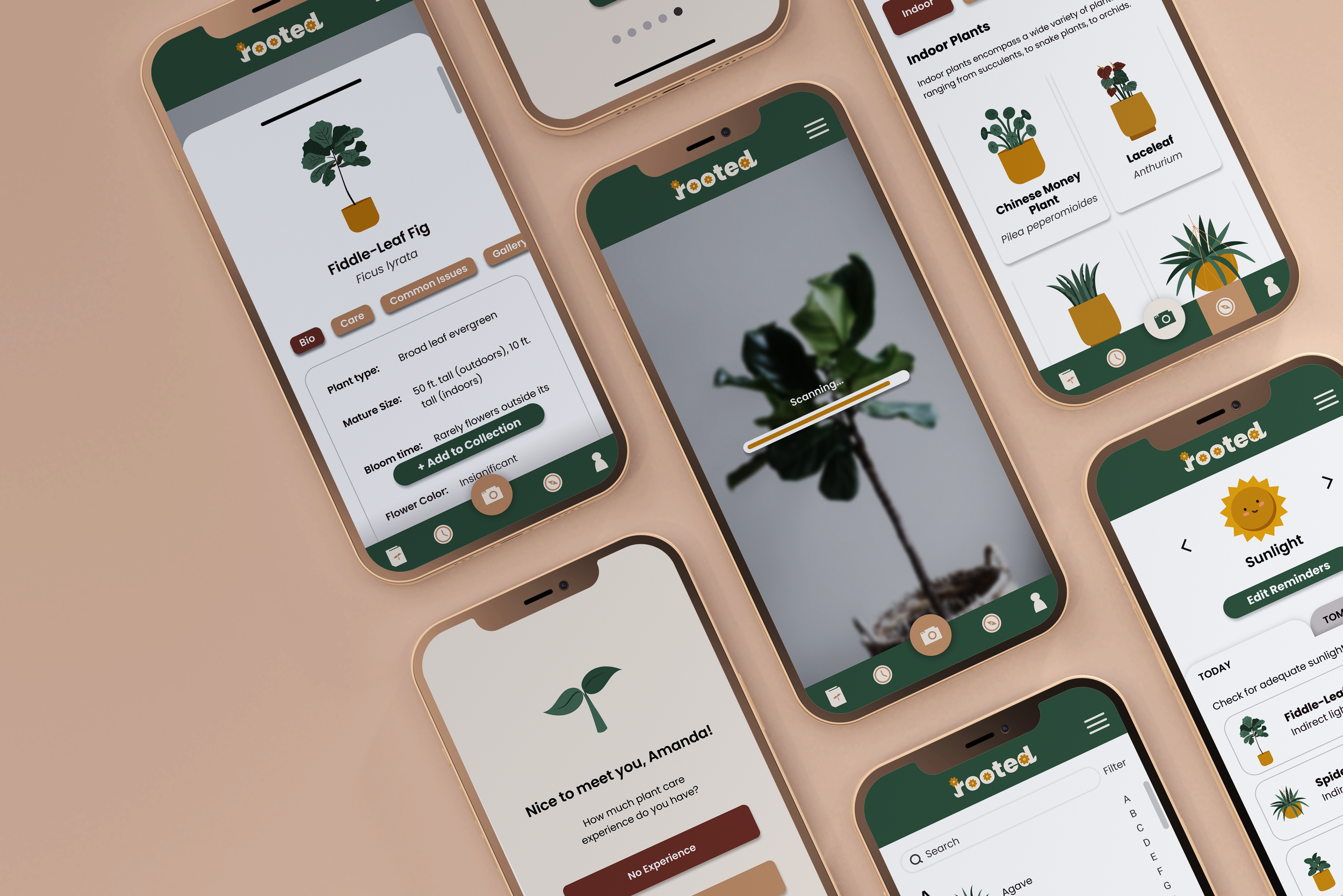
An example sequence of one of our features in mid-fi is using the plant scanner to identify a plant (shown below). The user would open the feature, use their camera in-app to scan the plant, which will then open a pop-up card that shows the plant’s information. The user can then add the plant to their collection of plants and also create new collections.

Transitioning to Hi-Fidelity
For this project, I took charge of establishing and organizing a design system (color palette, typography, illustrative/creative direction) to maintain a consistent style across team members as we all individually contributed to creating hi-fidelity mockups. I also created the main component library in Figma for my team to use for an efficient workflow.


Refining our designs, we updated our mid-fidelity wireframes to hi-fidelity mockups in Figma by utilizing the design system and component library.
We then created interactive prototypes to prepare our designs for user testing.
In creating tangible prototypes, we learned a great deal about how users would physically interact with our solution. We were also able to better visualize how each planned feature would actually be utilized to meet identified user needs. The prototype served as our foundation for the evaluation and refinement stages later on.
User Testing
To evaluate our high-fidelity prototype, we conducted 5 usability testing sessions with participants who were new or interested plant owners. The usability test consists of 6 short tasks to complete in the app, covering the core functionality and use cases. By evaluating our prototypes through usability testing, we were able to learn about the user experience of our primary features including what people liked and disliked. This informed the basis for our final prototype iterations.
Key Findings
Positive #1: Reminder system is highly appreciated.
3 out of 5 participants mentioned that the reminder system was helpful. This verified our initial hypothesis that the reminders would be useful to new and interested plant owners.
Positive #2: Scanning feature is convenient and of high value to these new plant owners.
3 out of 5 participants expressed praise for the convenience of the scanning feature, indicating that it relieved a key pain point for our target users.
Negative #1: Hamburger menu caused confusion since it wasn’t utilized.
4 out of 5 participants commented about the hamburger menu, due to its lack of functionality during usability testing.
Negative #2: Button contrast can be improved.
Locating buttons was difficult at times due to poor visibility. Several participants mentioned that the color of buttons or other icons made it difficult to locate/recognize as clickable items.
The Final Result
The final result of our design work accumulated to a high-fidelity working Figma prototype that depicts five sample user flows: Onboarding, Reminders, Scanner, Encyclopedia and an Explore page.

Feature - Plant Scanner

I took ownership over the scanner feature. Our aim with this flow was to provide users with an easy way of identifying plants and learning more about them all in one place.
Once a plant is identified using the in-app scanner, the feature would deliver the user a bio card about the plant. In a tabular format, the app shows the user information about the plant’s bio, care, common issues, photo gallery, and tips.
To bookmark the plant, the user can interact with the “Add to Collection” button, which allows them to add the plant to an existing collection the user has made, or add the plant to a new collection.
I prioritized a simple, tabular design to offer the user various kinds of information about the plant, while preventing cognitive overload.
Feature - Plant Encyclopedia
I also was the primary designer for the encyclopedia feature. I utilized the same pattern from the scanner feature to make plant bio cards consistent across the app
With the encyclopedia, users can browse plants alphabetically, which is especially helpful if the user knows the specific plant they are trying to find.

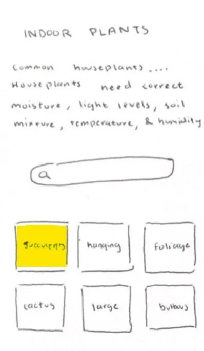
Feature - Explore

While the encyclopedia feature is good for spearfishing, we also wanted to provide users an easy way to explore different plants if they had some idea/no idea of what they were interested in.
We carried over the tabular format we utilized in other features, and grids of cards for a simple, yet aesthetic way of browsing different kinds of plants. Common plant groupings (e.g., indoor, outdoor, ferns, etc.) help users quickly explore types of plants without having to think too much.
Filtering allows the user to narrow down their exploration based on characteristics that were typical call outs in other apps/plant websites (e.g., leaf color, leaf type, mature size, flowering, etc.)
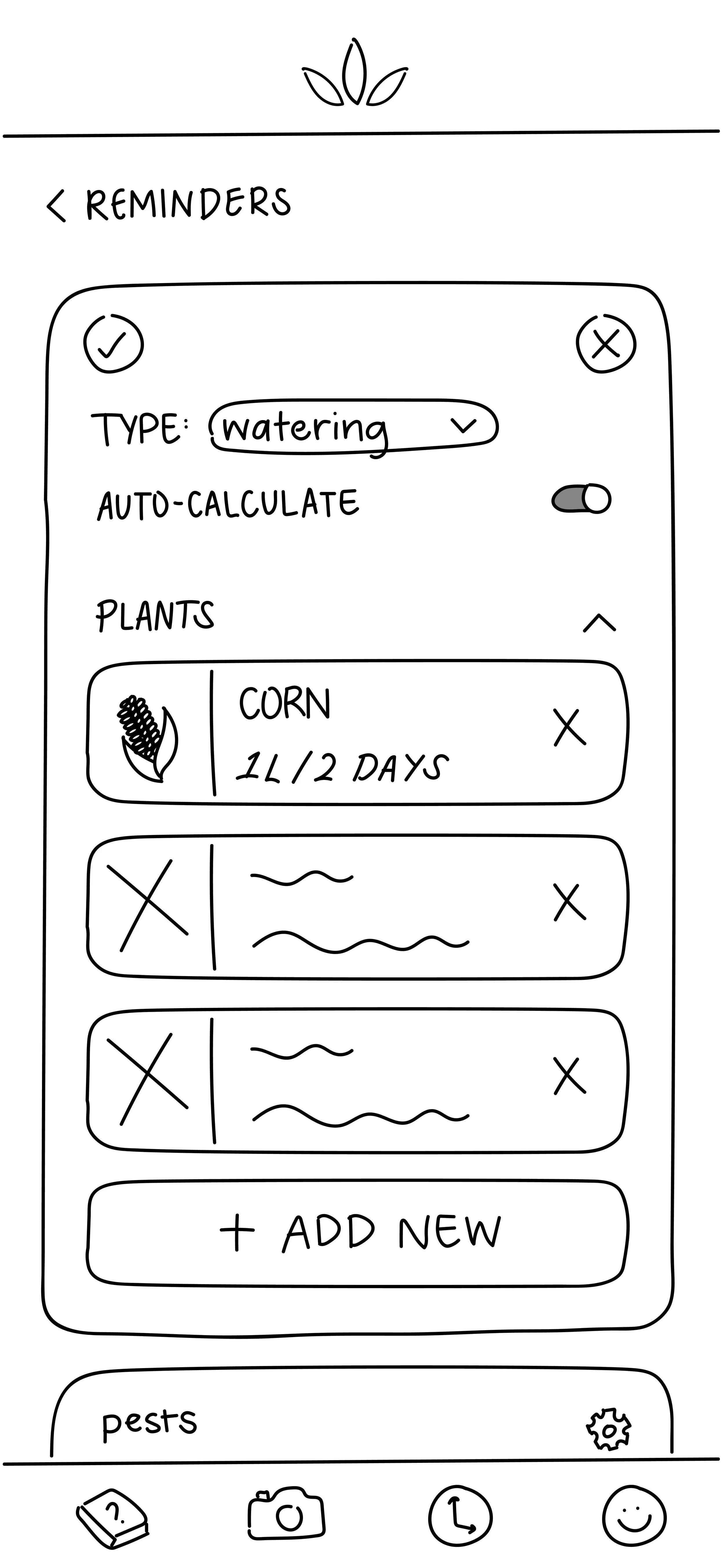
Feature - Reminders
While I was not as involved in the creation of the reminders feature, this was a key feature that we wanted to include in this app.
During interviews, participants stressed how plants all have different sunlight and watering needs, so we prioritized a simple reminder system design that allows them to keep track of all their different plant schedules in one place, sorted by those 2 categories.

Feature - Onboarding

During interviews, many new/interested plant owners didn’t know where to start - they were unsure if their home was an optimal environment for plants. I also wasn’t the lead designer of the onboarding feature, but it was important to our team to provide a delightful onboarding experience that can make a meaningful recommendation about which plants would thrive best in their location and based on their experience level. We wanted to be able to help users as soon as they interact with the app!
Lessons Learned & Next Steps
Being a course project, we had a strict 10 week timeline to follow. We originally wanted to solution for both novice and advanced plant owners, but ended up cutting scope to focus more specifically on the novice group. Initial design ideation included ideas that would benefit more advanced users, such as more complex pest control tools as well as repotting/replanting guides. We hope to continue with our progress by conducting more extensive customer research to validate our current features, while broadening our user group with more advanced feature implementation.
Working with a team of designers with varying backgrounds and skills, I’ve learned that good project management is key to any successful case study. I had to hone in on my leadership and communication skills to ensure my team was consistently on the same page. I had to accept that having different visions is normal, but a good team is able to gather different inputs and work together to formulate a unified output. Nonetheless, given the resources and amount of time given, I’m genuinely proud of all that my team accomplished, with a final prototype and presentation that received full marks at the end of the course. :)